
My Bullet Journal Journey | 2026 | Episode 4 | August

Hello Everyone!
It’s that time of the month again (no I don’t mean it in that way…although…no! That’s not it!)! It’s bullet journal time! Today, I’m coming at you with my August spread, and let me tell you, it was not easy, I mean, the execution was, but the ideas and themes I wanted to use for the August spread were much different to what I had actually made. Now, if you don’t know what I’m talking about, check out the video on YouTube, and of course, you don’t have to jump on over, you can just watch it here.
Now, as you can see, the theme for the month is seaside, specifically British seaside, thanks to that one fish and chips pattern from that Sail Away set I used. Honestly, I wasn’t expecting to go in this direction for August, I had a more ice cream/ice lolly design in mind, but because, as you already know, I wanted to use up the resources I have, I needed to be a bit more creative than that. I mean, you could argue that I could have still used the ice cream motif, but I don’t think it wouldn't have worked well with the colours and the patterns that I used in the end.

Of course, it also ties in with the calligraphy style I wanted to use for the month as well, and granted, it still would have worked with the ice cream theme, but in the end, I wanted to keep this month’s theme simple, especially with this density of patterns from my scrap paper. In the end, I’m happy with the way this spread turned out, although it’s probably not going to be one of my absolute favourites (I still love the Art Deco style from that one January spread I made, I might actually give that a try again, later). Nevertheless, we made it, and we’re going to use it.
Why The Seaside Theme?
As I mentioned before, I was going to do an ice cream, or a fruit themed spread, you know, to pair the video with the digital downloads I made for Patreon. If you haven’t checked them out, I highly recommend you do. I made them for you, if you don’t have time to make a bullet journal spread yourself! Anyway, back to the video...I wanted to use up all the patterned paper sets that I don’t actually use. So, if you’ve noticed in the video, the Sail Away set has many pieces left, compared with some of the others in the video, like the World Map set I had, or the Hipster set. I tend to use those patterned paper because I love the whole vintage look, and the brown colour schemes, especially when I make my September spreads (they are usually coffee themed, and I don’t plan to change that any time soon).

So, I decided to challenge myself to use the Sail Away set. Of course, this wasn't just so I could use it up, so it’s no longer just sitting in my storage bins, but I wanted to also see if I could to create a theme around it. That’s why the theme for August ended up being nautical. Not only that, but I also wanted to challenge myself and not use the floral stickers and washi tapes I used in the previous two journal spreads, for June and July, because I wanted to see if I could create a spread without them, or at least without them as part of the main theme. Yes, I do still use some flowers in the final designs, but they aren’t the main focal point. It’s the pattern of the washi tape, and the pattern of the scrap paper that really draws the eye. So, that’s why the spread looks the way it does.
What’s With the Scenery Stickers?
So, I’d bought these stickers, again, ages ago, and because it’s such a specific colour and theme, I need to use them with specific colours and themes, and because blue was such a prominent colour in this spread, I decided to use it, and it somehow worked. While all the other colours in the August spread are a little more muted, or warmer, the deep, dark blue adds a depth to the spread that I hadn’t expected, and it really does work well to contrast the vibrance of the patterns.
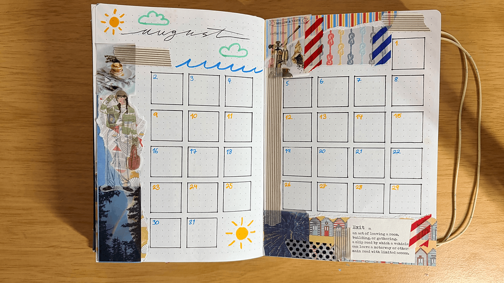
On the other hand, I did have to really curate what images would go on what pages. The stickers are small, but they weren’t small enough for some of the spreads I’d made, like for week 3. The white space was either too small, or too narrow for the sticker to fit. Of course, if I wanted to force it, I could have cut the sticker so it would fit, but it would defeat the purpose of using the scrapbook style. So, instead I chose carefully what stickers to use, and what double page spreads could do without, and it worked. I’m happy with the choices I made, especially since some of them really adhered to the summer theme I was going for.
Why The Simple Doodles?
I chose to create simple doodles this time, to match the simple theme I was going for. Like I said, I’m not an artist, I’m not that great with proportion, and I’ve not practiced my doodle art in quite some time. So, I wanted to stick with simple doodles this time round, again, to not only give me a break from the detailed spreads I’d made before, but to also ease me back into drawing doodles again.

Don’t worry, I will be starting to create more complicated ones, as time goes on, and because I’m now tracking that particular hobby, I’m sure my doodles will improve, and become more detailed, as time goes on. So, keep an eye on this series to see if or when my doodles do become more detailed. I might not be aware of it, but you guys will be, so let me know if you see an improvement.
You Changed The Calligraphy Style!
I told you I would. I don’t feel comfortable using the other styles. Mind you, it doesn’t mean I won’t use those other styles again, I’m actually planning to go back to the straighter, “boxier” style for September (refer to my previous September spread, that’s the style I’m thinking of using), because the theme I have in mind, for September (which you should all know by now will be a coffee theme) will need something a little more elegant than a scrawl.

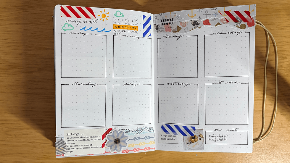
However, like I said in the video, I would much rather use this style of calligraphy, because then I’m not thinking about where on the page my pen will land, and it’s so much faster for me, because it’s almost my own cursive handwriting. Of course, if I continued to use this style, it wouldn’t be fair on you or me, because then we’ll remain stagnant, and creating a bullet journal is all about being creative and pushing the boundaries of our artistic and creative skills. So, that’s why, although I would much prefer using my cursive handwriting, I will attempt to explore other calligraphy styles as well.
Why Does The Bullet Journal Spread Look So Messy!
Of course it does. It’s supposed to. Like I said in the video, and in the previous ones as well, I’m trying to use up all the resources I currently have, before I start buying new ones. While I could buy more washi tape, to go with the themes I have in mind, that’s not what I’m trying to do here. My current bullet journal style is not only a beginner-friendly way to start bullet journaling, it’s also a more sustainable way to practice arts and crafts.


This is because I’m using up all the resources I previously bought, for other purposes, and using them in this journal. Not to mention, I’m also using the leftover scraps, from the torn pieces I make and using them in other parts of the journal spread as well, and if I can't use them in the journal I add them to my junk journal pages, which I showcase in my YouTube shorts. Of course, there will be some scraps that do still go into the bin, especially those that are too small to use, like very tiny torn edges, or small strips of tape that would be too thin to stick to a page, or even a piece of sticker that had to be cut off, so that the tacky side wouldn’t be exposed to air and dust for too long. These will still be a kind of waste that would be unavoidable, but buying a new set of washi tapes and stickers, just to satisfy my mood or the theme I’m planning to create, isn’t a sustainable way of practicing arts and crafts, at least in my opinion, and I hope you guys can see it that way too.
Let’s Go Out This Summer And Really Have Fun!
Ok, so I might have come across a little defensive there, at the end, but every word of it is true. I am trying my best to do my part, but it won’t always work out. Having said that, you can do the same, if you really put your mind to it, and that goes for your own bullet journal crafts. If you have leftover stationery, from previous craft projects, use them in your journal, and really have fun with it. Imagine you’re a child again, and you’ve just been plopped down in front a piece of paper with colouring pens and paints and just go crazy. It’s summer after all; it’s time to have some fun!

Alright, that’s enough from me, I’m going to go and finish off filming the next video, which (as I said in the video) will be a Sims build, but while I go do that, please don’t forget to like, subscribe, comment, share and follow me, here on Feather’s Charm, on my YouTube channel, on my other social media channels (Instagram, Twitter/X, TikTok), and on Patreon. Your support really does help me make more content like this, for you guys.
And as always, be kind, be creative, and be unique.
I’ll see you later!
Feather, out!


Comments